Readers who are familiar with precision agriculture have probably heard of the Normalized Difference Vegetation Index (NDVI), which allows farmers to get important information about the state of the vegetation on their farmland. Let’s see what this value is and how the data generated from Sentinel-2 satellite images can be applied to an agricultural area.
NDVI - Normalized Difference Vegetation Index
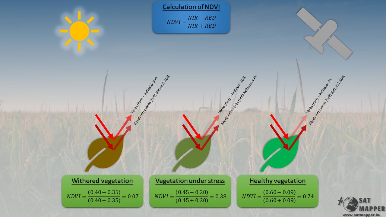
The abbreviation NDVI comes from Normalized Difference Vegetation Index, which is one of the most commonly mentioned indices in precision agriculture. Its value can be traced back to the ratio of red (RED) and near-infrared (NIR) light reflected and absorbed during photosynthesis by vegetation present on the field. The exact formula is shown at the top of the figure below.
If the examined area is covered with healthy vegetation, the reflected red light decreases compared to near infrared, while in the case of withered plants, the two lights are reflected in almost equal proportions (see figure below).
If we have the ability to take digital images of an area where one image is shot in the red (RED) and the other in the near-infrared (NIR) spectral band, the NDVI value can be calculated pixel by pixel.
Fortunately, everyone has such a “camera”, as anyone can access satellite images taken by Sentinel-2 optical satellites for free through the Open Access Hub, which includes images taken in the RED and NIR bands.
The illumination of the examined area is provided by the Sun, and then the rays reflected by the vegetation are recorded by the satellite in the form of a digital image.
According to the formula shown in the figure above, the value of NDVI can range from -1 to +1, soils without vegetation usually show a value between 0 and +0.05, while in the case of healthy vegetation it can reach 0.9.
This means that the higher the NDVI value, the healthier and richer the vegetation.
Displaying NDVI values
Now that we know how to calculate the NDVi value, however this is won’t be enough for customers. To make the NDVI data easy to understand for everyone, it is a good idea to assign a color scale to the NDVI values.
This is illustrated by the following NDVI image created for the administrative area of Kiszombor, Hungary. It can be clearly seen that the water-covered area in the middle of the recording shows values between -1 and -0.3, while the vegetation-covered areas tend to approach the maximum value.

By dragging the slider sideways in the interactive image below, anyone can test how reliable the NDVI value can indicate healthy vegetation.


The full, zoomable interactive map is available here, where besides NDVI, other indexes can be displayed as well.
Why is it worth to analyse NDVI data?
One NDVI image can already provide lot of information the farmer about the condition of his land that, he may not be aware when observing crop from the ground. An example for this is when the vegetation is inadequate in the middle of the field, either due to nutrient problems or due to pests. With the help of NDVI images, these areas can be localized, so that nutrients or other agents can be applied in a targeted manner and only in the required amount. These kind of images can be made with the help of satellites as well as drones. Both methods have their advantages / disadvantages, but we will talk about this in a later post …
But let’s see what happens if we have more than one NDVI image in a given year!
The great advantage of Sentinel-2 satellites is that they return frequently over a given area This means that a high number of images are available for the “Study area-1” from the year 2020. If we arrange the NDVI images created for this specific area in chronological order and then the average, maximum, and minimum values of the each image are plotted, the annual NDVI trend curve of the area can be obtained.
In the animation below, the growth phase of the vegetation and then the sudden decrease in NDVI caused by harvesting can be observed very well.


Due to their optical operation, Sentinel-2 satellites do not see through the cloud layers, therefore in October relatively few datapoints are available due to cloudy weather. Besides cloud coverage, another disadvantage of satellite remote sensing is that the atmoshpehere can affect data, making the curve noisy. However, this can be smoothed out if we take the simple moving average (SMA) of the data. The result is shown in the figure below.

What can we read from a curve like that, what extra information can a farmer get, who already knows his land quite well? It can be clearly seen from the curve above, that harvesting took place at the right time, since the average vegetation value (yellow curve) of the examined land approached the maximum value (green curve) at the first peak, however there were areas where the vegetation was lower than the average since the minimal NDVI value (red curve) was way beyond the average . Based on this we can state, that the narrower the channel enclosed by the maximum and minimum NDVI curves, the more uniform the soil.
But not only does an NDVI curve reveal the past, but it can also help in active decision making, as if the area is constantly monitored, an increasing and then flattening average vegetation index curve can indicate that the time is optimal for harvest.
In addition to the above, there is a less frequently mentioned but yet important area of the use for NDVI data. Probably everyone is aware that in many cases an agricultural enterprise can be built and developed from loans. Financial institutions take many factors into account when deciding to grant a loan, as they also have an interest in gaining a more detailed picture of their client’s economic background, therefore analyzing the NDVI data of the client’s land can be another factor in the future.
Financial institutions offering agricultural insurance have also recognized the potential of satellite data, as they now offer bundled satellite remote sensing services for their customers. An example of this service is available at this link.
Procedure for creating NDVI trend curves
The curves shown previously, were generated according to the following process using QGIS and Python. Besides the writing of the script, the most time-consuming subtask was the collecting of cloudless satellite imagery. Unfortunately, this is a difficult process to automate, although it is not impossible, but the most precise method is to collect them manually.

In addition to cloudless recordings, another criterion is that the examined area covers only one kind of plant, otherwise it can happen that two or more kind of vegetation with different growth period is present which will corrupt the results.
Summary
We can see that NDVI data can be very important for the increasingly widespread precision agriculture today. Not only does it help farmers in decision-making, but they can get a more complete picture of the characteristics and annual trends of their land and the impact of any intervention (fertilization, spraying) becomes traceable as well.
Don’t be surprised when both financial institutions and insurers will increasingly use satellite data, as their work is also greatly aided by satellite data, whether in the assessment of a loan or in the case of a damage.